data observability
Implementing Bigeye’s Lineage Plus
Implementing Bigeye’s Lineage Plus
Implementing Bigeye’s Lineage Plus
Implementing Bigeye’s Lineage Plus
Establish a foundation for AI-powered issue resolution by implementing automated lineage tracking and dependency-driven monitoring, enabling faster incident resolution and enhancing data reliability at scale.
Establish a foundation for AI-powered issue resolution by implementing automated lineage tracking and dependency-driven monitoring, enabling faster incident resolution and enhancing data reliability at scale.
Establish a foundation for AI-powered issue resolution by implementing automated lineage tracking and dependency-driven monitoring, enabling faster incident resolution and enhancing data reliability at scale.
Industry
Industry
Data Observability
Data Observability
Data Observability
Role
Role
Head of Product & Desgin
Head of Product & Desgin
Head of Product & Desgin
Year
Year
2025
2025
2025
Platform
Platform
Web
Web
Web
Overview
As Head of Product & Design, I led the research and product design efforts that brought Bigeye’s Lineage Plus and Dependency-Driven Monitoring to market. These features were designed to help data teams focus on the data that matters, reduce unnecessary monitoring, and improve trust in analytics. By addressing core issues in data lineage and dependency tracking, we set the foundation for AI-driven data quality, enabling organizations to proactively detect and prevent data issues instead of just reacting to them.
As Head of Product & Design, I led the research and product design efforts that brought Bigeye’s Lineage Plus and Dependency-Driven Monitoring to market. These features were designed to help data teams focus on the data that matters, reduce unnecessary monitoring, and improve trust in analytics. By addressing core issues in data lineage and dependency tracking, we set the foundation for AI-driven data quality, enabling organizations to proactively detect and prevent data issues instead of just reacting to them.
As Head of Product & Design, I led the research and product design efforts that brought Bigeye’s Lineage Plus and Dependency-Driven Monitoring to market. These features were designed to help data teams focus on the data that matters, reduce unnecessary monitoring, and improve trust in analytics. By addressing core issues in data lineage and dependency tracking, we set the foundation for AI-driven data quality, enabling organizations to proactively detect and prevent data issues instead of just reacting to them.
Result
By addressing the foundational challenges of data lineage and dependency tracking, we created a smarter, more efficient monitoring system that set the stage for AI-driven data quality. The result? Faster issue resolution, reduced operational overhead, and stronger trust in enterprise data.
By addressing the foundational challenges of data lineage and dependency tracking, we created a smarter, more efficient monitoring system that set the stage for AI-driven data quality. The result? Faster issue resolution, reduced operational overhead, and stronger trust in enterprise data.
By addressing the foundational challenges of data lineage and dependency tracking, we created a smarter, more efficient monitoring system that set the stage for AI-driven data quality. The result? Faster issue resolution, reduced operational overhead, and stronger trust in enterprise data.
30%
Faster MTTR on Lineage
Faster MTTR on Lineage
50%
↑ Data Trust Increase
↑ Data Trust Increase
80%
↑ Engagement Rate Increase
↑ Engagement Rate Increase
RESULT
RESULT
Product Launch
Product Launch
Product Launch
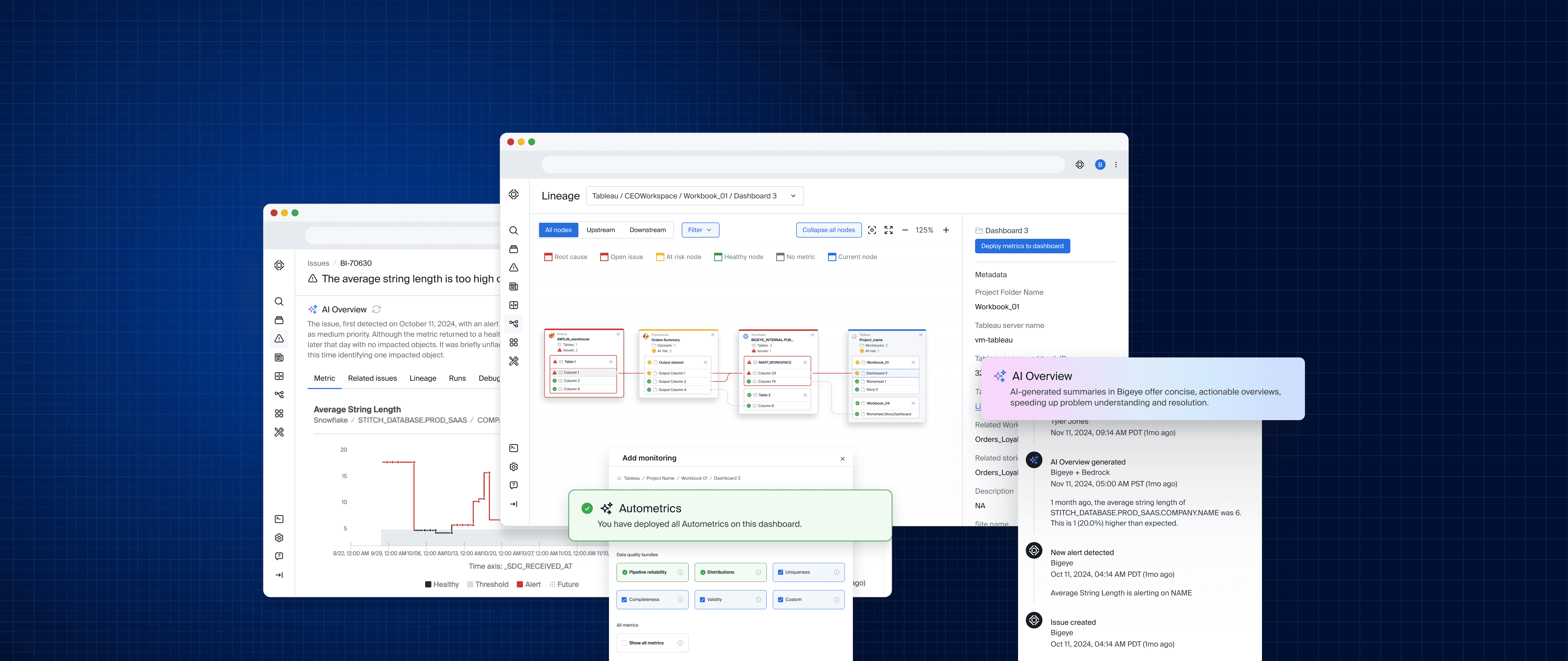
This quick screen recording shows just how easy it is for a non-technical user to manage data monitoring from start to finish. In just a few clicks, you can search for the data you care about, set up monitoring on key columns, and follow the lineage graph upstream to find where issues start. From there, you can click into the issue, regenerate the AI description for fresh insights, and even see a timeline of changes and suggestions. What used to be a bunch of complicated, disconnected tasks is now a simple, visual workflow that makes it easy for anyone to understand their data and fix problems fast.
Explore the case study below to understand the process that helped build these exciting set of features.
PROCESS
PROCESS
Design Thinking
Design Thinking
Design Thinking
By following the six-step Design Thinking process—Empathize, Define, Ideate, Prototype, Test, and Implement—I developed a structured approach to solving key challenges faced by enterprise data teams. This process ensured that our solution was user-centered, technically feasible, and aligned with business goals.
By following the six-step Design Thinking process—Empathize, Define, Ideate, Prototype, Test, and Implement—I developed a structured approach to solving key challenges faced by enterprise data teams. This process ensured that our solution was user-centered, technically feasible, and aligned with business goals.
By following the six-step Design Thinking process—Empathize, Define, Ideate, Prototype, Test, and Implement—I developed a structured approach to solving key challenges faced by enterprise data teams. This process ensured that our solution was user-centered, technically feasible, and aligned with business goals.

Building Empathy With Research
Empathy Building Research
Building Empathy With Research
Building Empathy With Research
EMPATHIZE
EMPATHIZE
Research
Research
Research
Quantitative Findings
I spent 30+ hours interviewing enterprise customers to dig into their team needs and uncover key challenges. To keep things consistent and reliable, I used a straightforward interview guide that ensured we got comparable insights across participants. Here’s what we found, by the numbers:
- 72% of participants expressed frustration with the manual effort required to resolve data quality issues and wanted more automation.
- 50% of users reported a lack of visibility into data movement across platforms, making troubleshooting slower, and causing operational inefficiencies.
- 100% of participants who evaluated Bigeye found AI-generated issue summaries valuable, but some teams faced adoption challenges due to their learning curve.
I spent 30+ hours interviewing enterprise customers to dig into their team needs and uncover key challenges. To keep things consistent and reliable, I used a straightforward interview guide that ensured we got comparable insights across participants. Here’s what we found, by the numbers:
72% of participants expressed frustration with the manual effort required to resolve data quality issues and wanted more automation.
50% of users reported a lack of visibility into data movement across platforms, making troubleshooting slower, and causing operational inefficiencies.
100% of participants who evaluated Bigeye found AI-generated issue summaries valuable, but some teams faced adoption challenges due to their learning curve.
72%
Participants Felt Frustrated
by Manual Data Resolution
Participants Felt Frustrated
by Manual Data Resolution
50%
Reported Lack of Visibility Across
Data Platforms Causing Friction
Reported Lack of Visibility Across
Data Platforms Causing Friction
100%
Participants found AI-generated
Issue Summaries Valuable
Participants found AI-generated
Issue Summaries Valuable
EMPATHIZE
EMPATHIZE
Research
Research
Research
Qualitative Findings
After talking to teams across multiple companies, some clear patterns emerged. The biggest challenges centered around manual data quality processes, the need for AI-driven issue resolution, and gaps in lineage & metadata visibility. Across the board, users were looking for smarter automation, better insights, and easier ways to track their data.
After talking to teams across multiple companies, some clear patterns emerged. The biggest challenges centered around manual data quality processes, the need for AI-driven issue resolution, and gaps in lineage & metadata visibility. Across the board, users were looking for smarter automation, better insights, and easier ways to track their data.
After talking to teams across multiple companies, some clear patterns emerged. The biggest challenges centered around manual data quality processes, the need for AI-driven issue resolution, and gaps in lineage & metadata visibility. Across the board, users were looking for smarter automation, better insights, and easier ways to track their data.
Quotes
Quotes
"We don’t have an enterprise-wide lineage tool yet, but leadership wants end-to-end lineage across SAP, Snowflake, and our analytics stack."
"We don’t have an enterprise-wide lineage tool yet, but leadership wants end-to-end lineage across SAP, Snowflake, and our analytics stack."

Sagar Raythatha
Data Architect, Colgate
"AI-generated summaries would be a game-changer for my team. We often spend too much time investigating raw logs before we even understand the problem."
"AI-generated summaries would be a game-changer for my team. We often spend too much time investigating raw logs before we even understand the problem."

Philipp Leufke
Principal Data Analyst, Vay
"We have a triage duty rotation to resolve data issues, but it’s inefficient. I'd love a system that automates issue detection and sends smart alerts to the right teams."
"We have a triage duty rotation to resolve data issues, but it’s inefficient. I'd love a system that automates issue detection and sends smart alerts to the right teams."

Chris Boden
Sr. Data Engineer, Super
More Personas, More Problems
More Personas, More Problems
More Personas, More Problems
More Personas, More Problems

DEFINE
Market Research
Quantitative Findings
Key challenges in the data lineage marketplace include siloed data
systems, clunky manual processes, and tools that are way too complicated for non-technical users. A lot of lineage platforms still don’t offer real-time monitoring, which means data issues can slip through the cracks before anyone notices. On top of that, business users and data stewards often struggle with these tools because they’re built with engineers in mind—not everyday users—and there’s still a big gap when it comes to no-code solutions.
Data complexity is growing: 80% of organizations operate in hybrid and multi-cloud environments, increasing the difficulty of tracking data movement.
Data trust issues: 70% of business leaders cite concerns about data reliability, leading to a lack of trust in analytics dashboards.
Regulatory compliance: 100% of our financial and healthcare organizations stated better traceability and auditability to meet governance standards.
80%
Enterprises Operate on
Hybrid Environments
70%
Data Leaders State
Concerns About Data Reliability
100%
Financial & Healthcare Organizations Sight Higher Governance Standards
DEFINE
Personas
Persona Based Problem Statements
After digging into hours of interviews and market research, it became clear that enterprise teams rely on data in very different ways—and our platform needed to reflect that. In large companies, there’s a huge ecosystem of people making decisions based on data, from executives and analysts to engineers and governance teams. The product experience naturally splits into two sides. On the top half, you’ve got non-technical business users who need data for decision-making, compliance, and governance. On the bottom half, technical data engineers are managing, transforming, and troubleshooting the data behind the scenes. The diagram we created maps this out, showing how these groups interact and depend on each other. By understanding these different perspectives, we built a platform that works seamlessly for both sides, making data easier to access, manage, and actually use across the company.
Problem Statements
“As a business user, I need a clear and intuitive way to track data lineage and understand dependencies without requiring deep technical expertise, so that I can ensure compliance, make informed decisions, and maintain data trust across my organization.”
Non-Technical Persona
“As a data engineer, I need AI-powered insights and automated lineage tracking to quickly identify the root cause of issues and reduce Mean Time to Resolution (MTTR), so that I can focus on solving problems instead of manually tracing dependencies.”
Technical Persona
DEFINE
DEFINE
Market Research
Market Research
Market Research
Quantitative Findings
Key challenges in the data lineage marketplace include siloed data systems, clunky manual processes, and tools that are way too complicated for non-technical users. A lot of lineage platforms still don’t offer real-time monitoring, which means data issues can slip through the cracks before anyone notices. On top of that, business users and data stewards often struggle with these tools because they’re built with engineers in mind—not everyday users—and there’s still a big gap when it comes to no-code solutions.
Data complexity is growing: 80% of organizations operate in hybrid and multi-cloud environments, increasing the difficulty of tracking data movement.
Data trust issues: 70% of business leaders cite concerns about data reliability, leading to a lack of trust in analytics dashboards.
Regulatory compliance: 100% of our financial and healthcare organizations stated better traceability and auditability to meet governance standards.
80%
Enterprises Operate on
Hybrid Environments
Enterprises Operate on
Hybrid Environments
70%
Data Leaders State
Concerns About Data Reliability
Data Leaders State
Concerns About Data Reliability
100%
Financial & Healthcare Organizations Sight Higher Governance Standards
Financial & Healthcare Organizations Sight
Higher Governance Standards
Financial & Healthcare Organizations Sight Higher Governance Standards
DEFINE
DEFINE
Personas
Personas
Personas
Persona Based Problem Statements
After digging into hours of interviews and market research, it became clear that enterprise teams rely on data in very different ways—and our platform needed to reflect that. In large companies, there’s a huge ecosystem of people making decisions based on data, from executives and analysts to engineers and governance teams. The product experience naturally splits into two sides. On the top half, you’ve got non-technical business users who need data for decision-making, compliance, and governance. On the bottom half, technical data engineers are managing, transforming, and troubleshooting the data behind the scenes. The diagram we created maps this out, showing how these groups interact and depend on each other. By understanding these different perspectives, we built a platform that works seamlessly for both sides, making data easier to access, manage, and actually use across the company.
After digging into hours of interviews and market research, it became clear that enterprise teams rely on data in very different ways—and our platform needed to reflect that. In large companies, there’s a huge ecosystem of people making decisions based on data, from executives and analysts to engineers and governance teams. The product experience naturally splits into two sides. On the top half, you’ve got non-technical business users who need data for decision-making, compliance, and governance. On the bottom half, technical data engineers are managing, transforming, and troubleshooting the data behind the scenes. The diagram we created maps this out, showing how these groups interact and depend on each other. By understanding these different perspectives, we built a platform that works seamlessly for both sides, making data easier to access, manage, and actually use across the company.
After digging into hours of interviews and market research, it became clear that enterprise teams rely on data in very different ways—and our platform needed to reflect that. In large companies, there’s a huge ecosystem of people making decisions based on data, from executives and analysts to engineers and governance teams. The product experience naturally splits into two sides. On the top half, you’ve got non-technical business users who need data for decision-making, compliance, and governance. On the bottom half, technical data engineers are managing, transforming, and troubleshooting the data behind the scenes. The diagram we created maps this out, showing how these groups interact and depend on each other. By understanding these different perspectives, we built a platform that works seamlessly for both sides, making data easier to access, manage, and actually use across the company.
Problem Statements
“As a business user, I need a clear and intuitive way to track data lineage and understand dependencies without requiring deep technical expertise, so that I can ensure compliance, make informed decisions, and maintain data trust across my organization.”
“As a business user, I need a clear and intuitive way to track data lineage and understand dependencies without requiring deep technical expertise, so that I can ensure compliance, make informed decisions, and maintain data trust across my organization.”
Non-Technical Persona
“As a data engineer, I need AI-powered insights and automated lineage tracking to quickly identify the root cause of issues and reduce Mean Time to Resolution (MTTR), so that I can focus on solving problems instead of manually tracing dependencies.”
“As a data engineer, I need AI-powered insights and automated lineage tracking to quickly identify the root cause of issues and reduce Mean Time to Resolution (MTTR), so that I can focus on solving problems instead of manually tracing dependencies.”
Technical Persona

Testing Ideas
Testing Ideas
Testing Ideas
Testing Ideas
IDEATE
IDEATE
Wireframes
Wireframes
Wireframes
I love sketching wireframes by hand—there’s something about pen and paper that helps me think fast and stay flexible as I explore different concepts.
I love sketching wireframes by hand—there’s something about pen and paper that helps me think fast and stay flexible as I explore different concepts.
I love sketching wireframes by hand—there’s something about pen and paper that helps me think fast and stay flexible as I explore different concepts.

PROTOTYPE
PROTOTYPE
Prototype Testing
Prototype Testing
Prototype Testing
We kicked off user testing right on the conference floor at Snowflake and Databricks events, giving us a chance to gather real-time feedback from potential users. Since the sales team was demoing it live, I needed to create a fully interactive prototype that was easy to showcase and explain on the spot. After the first round of testing, the team reported back on user sentiment and overall usability, giving us valuable insights into what worked well and where improvements were needed. From there, I continued to refine the prototypes and test with customers, making sure every iteration felt more intuitive, seamless, and aligned with user needs.
We kicked off user testing right on the conference floor at Snowflake and Databricks events, giving us a chance to gather real-time feedback from potential users. Since the sales team was demoing it live, I needed to create a fully interactive prototype that was easy to showcase and explain on the spot. After the first round of testing, the team reported back on user sentiment and overall usability, giving us valuable insights into what worked well and where improvements were needed. From there, I continued to refine the prototypes and test with customers, making sure every iteration felt more intuitive, seamless, and aligned with user needs.
We kicked off user testing right on the conference floor at Snowflake and Databricks events, giving us a chance to gather real-time feedback from potential users. Since the sales team was demoing it live, I needed to create a fully interactive prototype that was easy to showcase and explain on the spot. After the first round of testing, the team reported back on user sentiment and overall usability, giving us valuable insights into what worked well and where improvements were needed. From there, I continued to refine the prototypes and test with customers, making sure every iteration felt more intuitive, seamless, and aligned with user needs.
Prototype 1
In Prototype 1, we kept things simple by nesting each data object within the map and only showing logos and icons on the surface. The main goal here was to help users understand how the data flows — giving them a clear, visual way to trace relationships without overwhelming them right off the bat.

Prototype 1
Prototype 2
Prototype 3
Prototype 4
Prototype 1
In Prototype 1, we kept things simple by nesting each data object within the map and only showing logos and icons on the surface. The main goal here was to help users understand how the data flows — giving them a clear, visual way to trace relationships without overwhelming them right off the bat.
Prototype 1
Prototype 2
Prototype 3
Prototype 4
TEST
TEST
User Testing Scenario
User Testing Scenario
User Testing Scenario
Starting at the impacted report, traverses up the pipeline to understand the impacted nodes at a high level.
Can the user find the problematic lineage node within 10 seconds?
Utilize hover states to see the job name, what problem it is having, and the timestamp.
Did the user correctly identify the job name and the timestamp?
Expand the node. How many jobs are within the Stitch ETL tool?
Could the user name the job that failed and trace the connected downstream tables and columns visually?
Give the user a chance to play with the prototype.
How can they discern the difference between healthy objects and objects with issues?
TEST
TEST
Success Metrics
Success Metrics
Success Metrics
By testing the prototype, we were able to quickly validate the overall layout, color choices, and workflow, ensuring everything felt intuitive. The results were a huge success—100% of participants, regardless of their technical skill level, could easily understand the lineage graph. They were able to identify where issues originated downstream and track their impact all the way to the furthest upstream reports. With this confidence, we moved forward with higher-fidelity designs, knowing the core experience was clear and effective for all users.
By testing the prototype, we were able to quickly validate the overall layout, color choices, and workflow, ensuring everything felt intuitive. The results were a huge success—100% of participants, regardless of their technical skill level, could easily understand the lineage graph. They were able to identify where issues originated downstream and track their impact all the way to the furthest upstream reports. With this confidence, we moved forward with higher-fidelity designs, knowing the core experience was clear and effective for all users.
By testing the prototype, we were able to quickly validate the overall layout, color choices, and workflow, ensuring everything felt intuitive. The results were a huge success—100% of participants, regardless of their technical skill level, could easily understand the lineage graph. They were able to identify where issues originated downstream and track their impact all the way to the furthest upstream reports. With this confidence, we moved forward with higher-fidelity designs, knowing the core experience was clear and effective for all users.
Testing Hours
40
Visual Recognition
100%
Problem Discovery
~8 Sec
Implementing Feedback
Implementing Feedback
Implementing Feedback
Implementing Feedback
IMPLEMENT
User Feedback
User Feedback
After sharing the initial prototype at the conference, I took a step back to refine the designs based on customer feedback and user interviews. One thing that really stood out—100% of the customers interviewed mentioned using "stoplight colors" (red, yellow, green) to indicate the health of their data pipeline. That was a lightbulb moment for me! It made perfect sense and became a key inspiration for the high-fidelity designs. To take it a step further, I dug into Google Maps' UX/UI and pulled in some familiar visual cues to make the experience even more intuitive and easy to navigate.
After sharing the initial prototype at the conference, I took a step back to refine the designs based on customer feedback and user interviews. One thing that really stood out—100% of the customers interviewed mentioned using "stoplight colors" (red, yellow, green) to indicate the health of their data pipeline. That was a lightbulb moment for me! It made perfect sense and became a key inspiration for the high-fidelity designs. To take it a step further, I dug into Google Maps' UX/UI and pulled in some familiar visual cues to make the experience even more intuitive and easy to navigate.

IMPLEMENT
IMPLEMENT
Design System
Design System
Design System
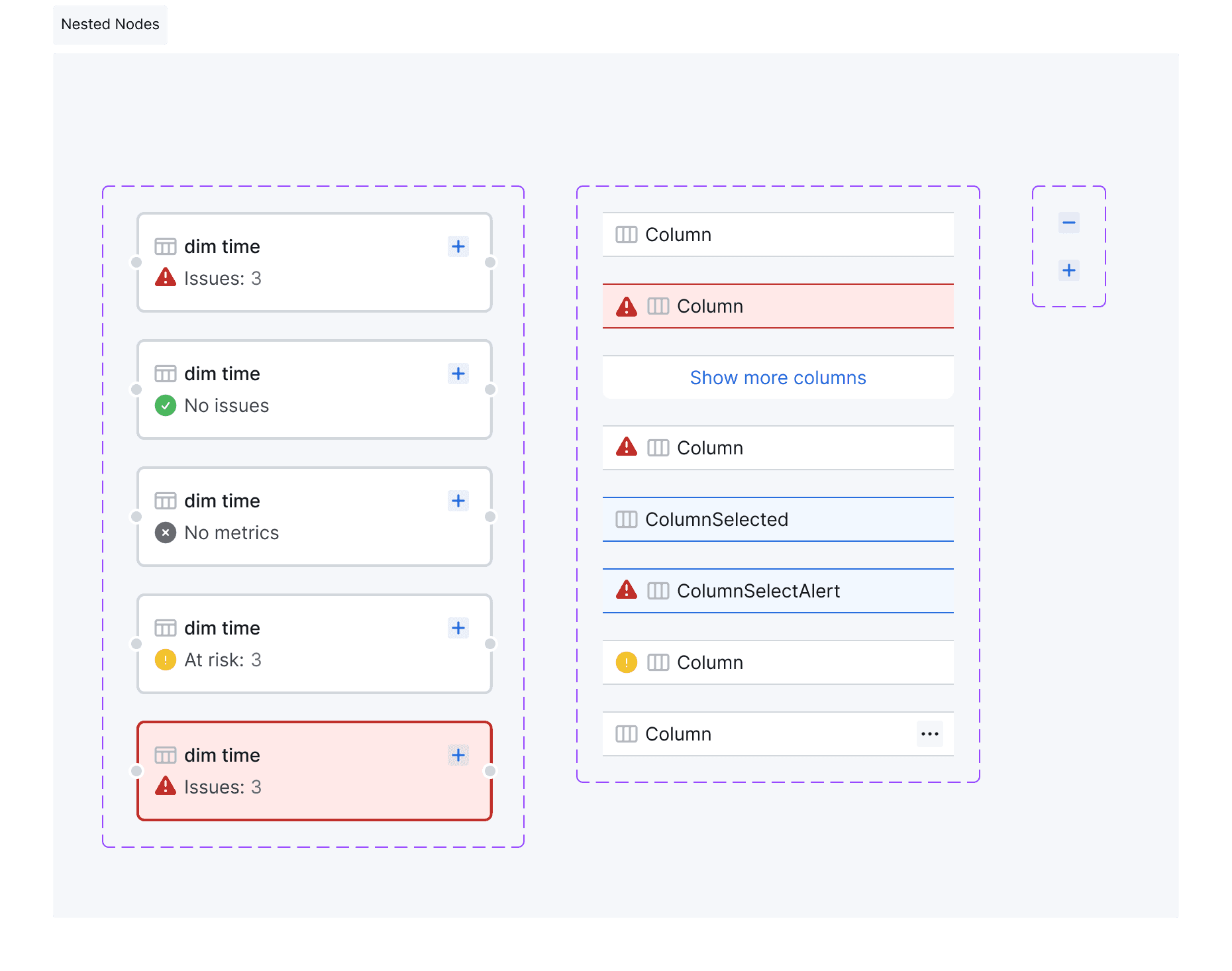
With just a few strategically designed components, we were able to map over 70 data connectors and organize their data structures into a clear, simplified lineage graph. The real magic came from these small but powerful components—each packed with layered interactions, smart business logic, and intuitive colors and icons. By breaking data down into just three core nodes—Schema, Table, and Column—we created a clean, flexible system that could scale without limits while keeping things easy to navigate. To round out the experience, we introduced graph manipulation tools like filtering, expanding, and collapsing nodes, making it effortless to traverse large data pipelines. Navigating complex data relationships became as simple as following directions in Google Maps, giving users a clear path to understanding their data flow at a glance.
With just a few strategically designed components, we were able to map over 70 data connectors and organize their data structures into a clear, simplified lineage graph. The real magic came from these small but powerful components—each packed with layered interactions, smart business logic, and intuitive colors and icons. By breaking data down into just three core nodes—Schema, Table, and Column—we created a clean, flexible system that could scale without limits while keeping things easy to navigate. To round out the experience, we introduced graph manipulation tools like filtering, expanding, and collapsing nodes, making it effortless to traverse large data pipelines. Navigating complex data relationships became as simple as following directions in Google Maps, giving users a clear path to understanding their data flow at a glance.
With just a few strategically designed components, we were able to map over 70 data connectors and organize their data structures into a clear, simplified lineage graph. The real magic came from these small but powerful components—each packed with layered interactions, smart business logic, and intuitive colors and icons. By breaking data down into just three core nodes—Schema, Table, and Column—we created a clean, flexible system that could scale without limits while keeping things easy to navigate. To round out the experience, we introduced graph manipulation tools like filtering, expanding, and collapsing nodes, making it effortless to traverse large data pipelines. Navigating complex data relationships became as simple as following directions in Google Maps, giving users a clear path to understanding their data flow at a glance.